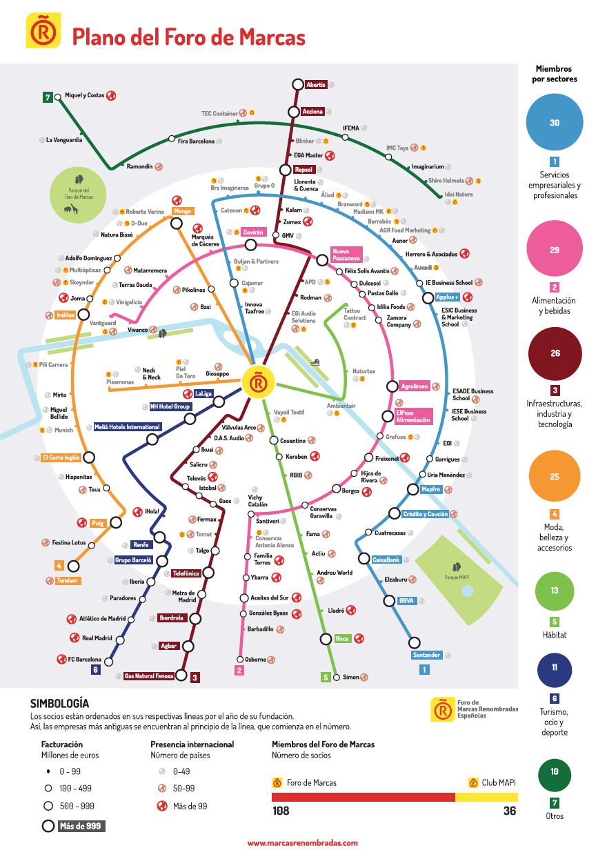
Diagrama conceptual sobre las marcas renombradas de España.
Se incluye como desplegable en la Memoria de Actividades 2017.
Foro de Marcas
Dosis Font
2018


Multimedia | Storytelling | Visualización | Infografía | Diseño | Contenido creativo | Desarrollo web

Diagrama conceptual sobre las marcas renombradas de España.
Se incluye como desplegable en la Memoria de Actividades 2017.
Foro de Marcas
Dosis Font
2018
Portada de la Memoria de Actividades 2017
Foro de Marcas Renombradas Españolas
2018
La memoria que recoge las actividades y proyectos desarrollados por el Foro de Marcas Renombradas Españolas a lo largo del año 2017, así como información sobre sus miembros.

Product Description
What’s your type? Suddenly everyone’s obsessed with fonts. Whether you’re enraged by Ikea’s Verdanagate, want to know what the Beach Boys have in common with easy Jet or why it’s okay to like Comic Sans, «Just My Type» will have the answer. Learn why using upper case got a New Zealand health worker sacked. Refer to Prince in the Tafkap years as a Dingbat (that works on many levels). Spot where movies get their time periods wrong and don’t be duped by fake posters on eBay. Simon Garfield meets the people behind the typefaces and along the way learns why some fonts – like men – are from Mars and some are from Venus. From type on the high street and album covers, to the print in our homes and offices, Garfield is the font of all types of knowledge.
About the Author
Simon Garfield writes for the Observer about science, health and the arts. He is a former editor of Time Out, and his book The End of Innocence won the Somerset Maugham Prize. He has written and edited twelve books, including the bestselling Mass Observation diaries.
——————————————————————————–
Product Details
Hardcover: 352 pages
Publisher: Profile Books Ltd (October 21, 2010)
ISBN-10: 1846683017
ISBN-13: 978-1846683015
Product Dimensions: 8.3 x 5.8 x 1.3 inches
Shipping Weight: 1.2 pounds
Just My Type is a book of stories about fonts. It examines how Helvetica and Comic Sans took over the world. It explains why we are still influenced by type choices made more than 500 years ago, and why the T in the Beatles logo is longer than the other letters. It profiles the great originators of type, from Baskerville to Zapf, as well as people like Neville Brody who threw out the rulebook. The book is about that pivotal moment when fonts left the world of Letraset and were loaded onto computers, and typefaces became something we realized we all have an opinion about. And beyond all this, the book reveals what may be the very best and worst fonts in the world – and what your choice of font says about you.

EUROPA EN PAPEL
Biblioteca Nacional de España.
Paseo de Recoletos, 20.
Madrid.
Información en la página digital del Ministerio de Cultura:
La Biblioteca Nacional de España presenta, coincidiendo con la presidencia española de la Unión Europea durante el primer semestre de 2010, la exposición Europa en papel, organizada en colaboración con la Sociedad Estatal de Conmemoraciones Culturales a partir de la selección de algunos de los ejemplares más emblemáticos que se conservan en la Biblioteca Nacional de España, que ilustran la historia del continente ahondando en las raíces históricas del proyecto común europeo.
Horario:
Del 11 de marzo hasta el 6 de junio de 2010. Martes a sábado de 10:00 a 21:00 h., domingos de 10:00 a 14:00 h. Entrada libre (último pase 30 minutos antes del cierre)

Se diseñó para ser el primer receptor comercial de noticias. Las noticias se imprimirían automáticamente sobre un papel enrollado. En 1938.

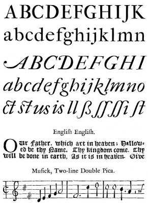


Su tipografía se basaba en la tradición del también tipógrafo Stanley Morison. Ridler diseñó el libro de Morison ‘John Fell, the University Press, and the Fell Types’ (275 páginas sobre tipografía del siglo XVII).
Imprimió el famoso ‘Rotz Atlas’ para Lord Eccles, ‘the Great Tournament Roll of the Collage of Arms’ (1969) o ‘the New English Bible’.
Fue presidente de ‘The British Federation of Master Printers’ (1968-69) y del ‘Double Crown Club’ (1963). Se retiró de la profesión en 1978.