STATS: Barómetro de corrupción 2010, International Transparency

Global Corruption Barometer 2010
Muy buena presentación en su versión en inglés.
Magnífica aplicación interactiva.

Corruption is the abuse of entrusted power for private gain. It hurts everyone whose life, livelihood or happiness depends on the integrity of people in a position of authority.

Gracias por visitar el sitio de Juantxo Cruz

Aumenta la corrupción en la UE en los tres últimos años.

Gracias por visitar el sitio de Juantxo Cruz

En España también.

Gracias por visitar el sitio de Juantxo Cruz

Menos del 6% de los encuestados admiten pagar sobornos en España en el último año.

Transparency International’s Global Corruption Barometer (the Barometer) is the largest cross-country survey to collect the general public’s views on and experiences of corruption.
In 2010 the Barometer interviewed more than 91,500 people in 86 countries, making it the most comprehensive edition since it was launched in 2003. The Barometer explores the general public’s views about corruption levels in their country and their government’s efforts to fight corruption. The 2010 Barometer also probes the frequency of bribery, reasons for paying a bribe in the past year, and attitudes towards reporting incidents of corruption.

Transparency International (TI) es la organización global de la sociedad
civil que lidera la lucha contra la corrupción. A través de más de
90 capítulos en todo el mundo y una secretaría internacional en Berlín,
TI crea conciencia acerca de los efectos nocivos de la corrupción y trabaja
junto a distintos socios en el gobierno, las empresas y la sociedad civil
para desarrollar e implementar medidas efectivas para combatirla.

GRAPHICS: Los gráficos del año

Gracias por visitar el sitio de Juantxo Cruz

Los termómetros económicos, en máximos históricos.
Los peores días para el bolsillo.
Una pesadilla en forma de gráfico de fiebre.
Reformas profundas.
Presión de las agencias de ‘rating’.
Sin rentabilidad, no hay compra.
La imágenes son de Bloomberg Solutions.

Gracias por visitar el sitio de Juantxo Cruz

El bono español a 2, 3, 5 y 10 años.
En el ejemplo, a 10 años.
Se hundió a máximos históricos.
Encarecimiento diario de los costes de financiación.

Gracias por visitar el sitio de Juantxo Cruz

La prima de riesgo.
También en récords.
El sobreprecio que exigen los inversores por comprar deuda de un país frente a la alemana. La diferencia entre invertir en deuda española e invertir en la alemana.

Gracias por visitar el sitio de Juantxo Cruz

El seguro de impago de la deuda de España (CDS, Credit Default Swaps).
La subida muestra la desconfianza de los mercados internacionales y propicia la salida masiva de capital del mercado. Caída de la bolsa.
Muestra la percepción del riesgo de insolvencia de un país.

Gracias por visitar el sitio de Juantxo Cruz

Seguros de impago por países.
En máximos, produce pánico en los gobiernos (Grecia, Portugal, Irlanda, Hungría, Ucrania, España…)

Gracias por visitar el sitio de Juantxo Cruz

El índice de volatilidad (VIX)
Se utiliza para medir el riesgo a lo largo de un periodo de tiempo. Así, una volatilidad alta es vista como negativa, ya que representa incertidumbre y riesgo.
Complicado de explicar y entender.

De los fijos de bolsa e Ibex35, a una especialización económica importante.

STATS: Doing Business 2011, World Bank

Doing Business 2011
Making a Difference for Entrepreneurs
Análisis de 183 países.
World Bank, International Finance Corporation .

Gracias por visitar el sitio de Juantxo Cruz

Clasificación de los países en los que es más fácil hacer negocios.
España pierde un puesto, en el 49.
Suecia sube 4 puestos, al 14, por, entre otras medidas, una reducción del capital mínimo para iniciar un negocio.

Gracias por visitar el sitio de Juantxo Cruz

Comparación de los costes laborales

En España:
– Contratos por un tiempo fijo prohibidos para trabajos permanentes (Alemania, Reino Unido, Holanda, EEUU no lo prohibe).
– Máxima duración de un contrato por tiempo fijo: 12 meses (en otros, sin límite o mucho más tiempo)
– Salario mínimo para un trabajador de 19 años: 1.059 dólares (bajo)
– Ratio salario mínimo/valor añadido por trabajador: 0,27
– Se pueden trabajar más de 50 horas semanales (sólo Francia no lo permite).
– Días máximos de trabajo por semana: 5,5 (en otros, hasta 6)
– Extras por noche trabajada: 25% del sueldo (en otros países no hay).
– Extras por fines de semana: no, Finlandia y Alemania, Sí.
– Restricciones de trabajo en días festivos: Sí, en otros países no.
– Días de vacaciones pagadas: 22 días. En EEUU, 0. En otros se pagan más días, 28 en el Reino Unido, 25 en Suecia, 30 en Finlandia y Francia.
– Despidos: se debe comunicar a una tercera parte (Trabajo). En EEUU y Reino Unido, no.
– Periodo para comunicar un despido: 2,1 semanas. En EEUU es 0. En el resto, bastante más tiempo.
– Pago por despido: 15,2 semanas de salario. En el resto, bastante menos.

Gracias por visitar el sitio de Juantxo Cruz

Cuadro resumen de España.

QUICK RESPONSE TO CRISIS
The global crisis triggered major legal and institutional reforms in 2009/10.
Facing rising numbers of insolvencies and debt disputes, 16 economies, mostly in Eastern Europe and Central Asia and the OECD high-income group, reformed their insolvency regimes, including Belgium, the Czech Republic, Hungary, Japan, the Republic of Korea, Romania, Spain, the United Kingdom and the Baltic states-

Doing Business 2011 is the eighth in a series of annual reports investigating the
regulations that enhance business activity and those that constrain it. Doing Business
presents quantitative indicators on business regulations and the protection of property
rights that can be compared across 183 economies—from Afghanistan to Zimbabwe—
and over time.

Janamitra Devan
Vice President and Head of Network
Financial & Private Sector Development
The World Bank–International Finance
Corporation

© 2010 The International Bank for Reconstruction and Development / The World Bank
1818 H Street NW
Washington, DC 20433
Telephone 202-473-1000
Internet www.worldbank.org

GRAPHICS: Valor-País, everis

Un momento clave de oportunidad para construir entre todos la España admirada del futuro.
Una visión optimista pero contundente de la Sociedad Civil española.
FUNDACIÓN EVERIS.
Iniciativa Transforma España lanzada por la Fundación everis.
100 líderes empresariales y expertos.
Presidente: Eduardo Serra.

Gracias por visitar el sitio de Juantxo Cruz

Denuncian un agotamiento del modelo vigente.
El gráfico muestra la evolución de lo que llaman VALOR-PAÍS, 1997-2009.
Proyección 2020.

Explicación en el informe:

1997=100 puntos básicos.

2002= España incrementa su valor en más de 20 puntos básicos. De ellos, 6,9 puntos básicos se deben al aumento de valor relativo, y el resto (13,5) al incremento de valor absoluto.

2002-2007= España consigue aumentar su valor como país hasta en 23 puntos básicos respecto a 1997.

2007-2009= En apenas dos años, España pierde prácticamente todo el valor ganado
desde 1997, y retrocede hasta quedarse en los 101 puntos básicos.

2010-2020= dos proyecciones simplistas en formato de análisis what-if (qué hubiera pasado si…).

a) Proyección corrigiendo la tendencia actual, el valor-país que aparece representado en el 2020 con los colores nítidos.
Decrecimiento suave como resultado del estancamiento de España y de su pérdida de relevancia mundial.

b) Proyección utilizando la tendencia de crecimiento anterior, la del periodo 1997-2002, en colores difuminados.
El valor-país resultante casi duplica el de la proyección anterior, reflejo en alguna medida de la oportunidad latente y no aprovechada.

Se considera tanto la evolución del país respecto a sí mismo (denominado valor-país absoluto), como frente a la misma muestra de países (valor-país relativo), con una proporción 70/30 entre ambos. En la construcción de este indicador de valor-país, se agrega con igual peso aspectos relativos a competitividad, bienestar, sostenibilidad, influencia, calidad de gobierno y desarrollo de la Economía del Conocimiento.

La muestra de países:

• Países periféricos Europeos: España, Grecia, Irlanda, Italia y Portugal
• Referentes de la UE (acrónimos RUE): Alemania, Francia, Holanda y Reino Unido
• Países no europeos del G8 (acrónimos PNEG8): Canadá, EE.UU. y Japón
• Países emergentes: Chile, Corea del Sur y México
• BRIC: Brasil, Rusia, India y China
• Emergentes de África: Egipto y Sudáfrica

• Madurez-país. Agrupa los índices que inciden más directamente en la creación de un país con un menor riesgo y mayor estabilidad socioeconómica. Incluye: bienestar, sostenibilidad, madurez socio-política y eficiencia de las Administraciones Públicas.

• Oportunidad-país. Reúne los índices que más intervienen a la hora de propiciar en el país escenarios con mayores oportunidades de desarrollo socioeconómico. Incluye:
competitividad, influencia, crecimiento y Economía del Conocimiento.

En la construcción de este indicador de valor-país, se agrega con igual peso aspectos relativos a competitividad, bienestar, sostenibilidad, influencia, calidad de gobierno y desarrollo de la Economía del Conocimiento. Por la heterogeneidad de los datos contemplados, este indicador no se debe entender como un «absoluto» en el que prima la exactitud fina del dato, sino como un «termómetro» de la evolución del país. Al comparar en el dibujo dos instantes de tiempo diferentes, se debe tener en cuenta que no habrá cambiado sólo el valor de España: lo habrá hecho tanto el valor referente contra el que se comparan algunas de las magnitudes consideradas (por ejemplo, Economía del Conocimiento) como el peso relativo de España frente al mundo.

Fuente: Elaboración propia en base a datos de World Bank, OCDE, OMS, UNESCO, OIT y WIPO.

INDEX: ATCO-hour, productividad y control aéreo

Gracias por visitar el sitio de Juantxo Cruz

PRR 2009
Performance Review Report
An Assessment of Air Traffic Management in Europe
during the Calendar Year 2009
European Organisation for the Safety of Air Navigation
EUROCONTROL, 96, rue de la Fusée, B-1130 Brussels, Belgium

Gracias por visitar el sitio de Juantxo Cruz

Cuadro de los términos internacionales para expresar la productividad de los controladores aéreos.

ACC (Area Control Center) Responsible for the safe flow of traffic along airways (–> En-route) and in certain portions of terminal control areas (–> APP). Significant horizontal and vertical growth in the areas to be controlled requires subdivision into various sectors of activity, either geographically or according to altitude, depending on traffic density.

Air Traffic Controller (ATCO) Manages and monitors, from the airport of take-off to that of landing, all of the aircraft present in the portion of airspace for which he or she is responsible. Skyguide employs about 450 civil ATCOs and 90 military ATCOs. The profession of ATCO is open to both men and women.

‘Sector productivity: This is the ratio of the output, measured by the flight-hours controlled by the ACC, to (area control) sector-hours open. This indicator shows, on
average, how many aircraft are simultaneously in a sector for a given ACC. All else being equal, higher sector productivity will improve ATCO-hour productivity.

 Staffing per sector: This is the ratio of ATCO-hours on duty to sector-hours open. This indicator shows, on average, how many ATCOs are used to man a sector. All else being equal, a reduction in the staffing per sector will increase ATCO-hour productivity.

ATCO-hour productivity can be more easily compared in an international benchmarking
environment. The average number of hours on duty is not a performance indicator per se and is mostly determined by the social bargaining and regulatory framework that prevails in each ANSP and State. Moreover, average hours on duty should be seen in the context of the employment costs’.

Gracias por visitar el sitio de Juantxo Cruz

El coste del empleo por hora de control (ATCO).
El último dato es de 2008.
AENA tendría el coste más alto de Europa.
191 euros por hora de control.
La media es 99 euros.

Gracias por visitar el sitio de Juantxo Cruz

Productividad = nº compuesto de horas de vuelo controladas / nº de horas de ATCOs in OPS (Composite flight-hours per ATCO-hour)

El índice que mide la productividad del control aéreo (ATCO-hour productivity)
AENA, bajo, según EUROCONTROL.

Gracias por visitar el sitio de Juantxo Cruz

Coste del empleo por hora de vuelo.
AENA: 354 euros
Media: 127 euros

Gracias por visitar el sitio de Juantxo Cruz

Relación de la productividad con el coste del empleo.

‘In terms of the cost base, Aena is the largest European ANSP,
with costs amounting to around 16% of the European total (for
a traffic representing 10% of the European total).
Over five years, its traffic has grown by +4% a year, but has
slightly declined in 2008. Over the period Aena experienced
the highest traffic growth among the five largest ANSPs
(+17%). Overall, the complexity of its traffic is intermediate.
Among the other four large ANSPs, Aena’s traffic shows
significantly less complexity’.

ATM Cost-Effectiveness (ACE)
2008 Benchmarking Report
Prepared by the Performance Review Unit (PRU)
with the ACEWorking Group
Junio de 2010

La Asociación Profesional de Controladores de Tránsito Aéreo no está de acuerdo con los datos de EUROCONTROL:

– ‘En primer lugar es importante destacar que estos estudios de Eurocontrol comparan proveedores de servicios de navegación aérea que en absoluto son homogéneos.
– Aena no ha seguido fielmente las directrices de EUROCONTROL (Performance Review Comission, PRC) en cuanto a la información facilitada para la elaboración de los informes comparativos, información que por otro lado no es objeto de auditoría alguna’.

Informe de APROCTA: las mentiras sobre los controladores.

STATS: The Global Gender Gap Report

The Global Gender Gap Report
Ricardo Hausmann, Harvard University
Laura D. Tyson, University of California, Berkeley
Saadia Zahidi,World Economic Forum

Mide las diferencias entre hombres y mujeres para el acceso a la política, economía, salud, trabajo…

The Index is designed to measure gender-based gaps in
access to resources and opportunities in individual countries
rather than the actual levels of the available resources
and opportunities in those countries.

Convert to ratios
First, all data are converted to female/male ratios. For
example, a country with 20% of women in ministerial
positions is assigned a ratio of 20 women /80 men =
0.25 on this variable. This is to ensure that the Index is
capturing gaps between women’s and men’s attainment
levels, rather than the levels themselves.

Gracias por visitar el sitio de Juantxo Cruz

Desde 2006
España, en el puesto 11.

Gracias por visitar el sitio de Juantxo Cruz

The result puts Switzerland alongside Finland,
Norway, Spain and Cape Verde as countries identified by
the Inter-Parliamentary Union as having a majority of
women in government.

Spain moves up six places in the overall report rankings,
improving its scores across all subindexes to regain
the same overall position it held in 2006. It records some
small gains in the category of women’s economic participation
and opportunity (increases in female labour force
participation, wage equality and estimated earned income,
as well as in the numbers of female professional and technical
workers). Spain’s strengths include the number of
women in ministerial positions, an area where Spain is
among the countries with the highest percentage out of
the 134 countries covered.

However, Spain still ranks towards the very bottom on wage equality, assuming 117th
position. Improvements to Spain’s performance in terms of
women’s economic participation may be expected in the
future following the recent introduction of a law that obligates
all companies with more than 250 employees to create
gender equality plans and the largest companies to
have 40-percent female boards of directors by 2015. The
new law also grants 15 days’ paternity leave to new
fathers. In addition, women must take up at least 40 percent
of the lists of candidates that parties field in elections,
under the new law.

Switzerland, Belgium, Spain, Finland
and Ireland show the largest absolute increases in score,
amounting to relative changes of more than 14% when
compared to their performance in the year 2000.

The Global Gender Gap Report 2010 is
published by the World Economic Forum. The
Global Gender Gap Index 2010 is the result of
collaboration with faculty at Harvard University
and the University of California, Berkeley

© 2010 World Economic Forum
All rights reserved.

GRAPHICS: Nivel de corrupción, Transparency International


Transparency International

The Global Coalition Against Corruption
Corruption Index 2010

‘Corruption is the abuse of entrusted power for private gain. It hurts everyone whose life, livelihood or happiness depends on the integrity of people in a position of authority’.

Gracias por visitar el sitio de Juantxo Cruz

Mapa interactivo

Gracias por visitar el sitio de Juantxo Cruz

Escala de la corrupción.
The 2010 Corruption Perceptions Index shows that nearly three quarters of the 178 countries in the index score below five, on a scale from 10 (very clean) to 0 (highly corrupt). These results indicate a serious corruption problem.

Pasos para el cálculo del IPC:
1. El primer paso para calcular el IPC consiste en estandarizar los datos
proporcionados por las fuentes individuales (es decir, traducirlos a una escala
común). Para ello, utilizamos lo que se denomina técnica de matching de
percentiles, que toma en cuenta las clasificaciones de países proporcionadas por
cada fuente individual. Esta técnica resulta útil para combinar fuentes con
diferentes distribuciones. Si bien al emplearla se pierden algunos datos,
garantiza que todas las puntuaciones permanezcan dentro de los límites del IPC,
es decir, entre 0 y 10.

2. El segundo paso consiste en someter las puntuaciones estandarizadas a una
transformación beta. Esto aumenta la desviación estándar entre todos los países
incluidos en el IPC y permite distinguir de manera más precisa a los países que
aparentemente presentan puntuaciones similares.

3. Por último, para determinar las puntuaciones del IPC se promedian todos los
valores estandarizados de cada país.

Gracias por visitar el sitio de Juantxo Cruz

Visualización general.
España se encuentra en el puesto 30.
En Europa, ocuparía el puesto 18.

Gracias por visitar el sitio de Juantxo Cruz

Organigrama.

Transparency International Secretariat
Alt-Moabit 96
10559 Berlin
Tel. +49-30-3438 20-0
Fax +49-30-3470 3912

TRANSPARENCY INTERNATIONAL
Liaison Office to the EU (AISBL)
Rue Breydel 40
B-1040 Brussels, Belgium

Phone: +32 (0)2 23 58 621
Email: brussels@transparency.org
Twitter: http://twitter.com/ti_eu
Blog: http://europeblog.transparency.org
Website: http://www.transparencyinternational.eu

CHAIR
Huguette Labelle holds a Doctor of Philosophy, Education. She is a Companion of the Order of Canada. She has been awarded honorary degrees from twelve Canadian Universities and has received the Vanier medal of the Institute of Public Administration of Canada, the Outstanding Achievement Award of the public service of Canada, the McGill Management Achievement Award and l’ordre de la Pleiade.

VICE CHAIR
Akere T. Muna is founder and former president of Transparency International Cameroon. A lawyer by training, he is President of the Pan African Lawyers Union and former president of the Cameroon Bar Association. In October 2008, Akere Muna was elected President of the African Union’s Economic, Social and Cultural Council (ECOSOCC). Mr Muna is a member of several national commissions on legal reform and curbing corruption. In January 2010 he was elected as one of the 4 new members to the Panel of Eminent Persons (APR panel). He is also member of the International Anti-Corruption Council. Mr Muna is still in active Legal Practice as the Managing Partner of Muna, Muna and Associates, one of oldest law firms in Cameroon.

MAPS: Sequía, 2000-2099, UCAR

Drought under global warning: a review
Aiguo Dai
Publication: Wiley Interdisciplinary Reviews: Climate Change
National Center for Atmospheric Research (NCAR)

The detailed analysis concludes that warming temperatures associated with climate change will likely create increasingly dry conditions across much of the globe in the next 30 years, possibly reaching a scale in some regions by the end of the century that has rarely, if ever, been observed in modern times.

Gracias por visitar el sitio de Juantxo Cruz

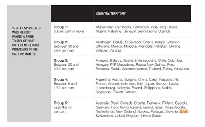
Future drought. These four maps illustrate the potential for future drought worldwide over the decades indicated, based on current projections of future greenhouse gas emissions. These maps are not intended as forecasts, since the actual course of projected greenhouse gas emissions as well as natural climate variations could alter the drought patterns.

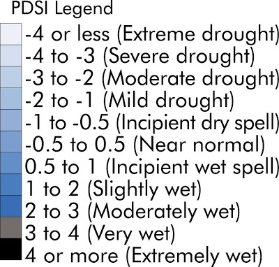
The maps use a common measure, the Palmer Drought Severity Index, which assigns positive numbers when conditions are unusually wet for a particular region, and negative numbers when conditions are unusually dry. A reading of -4 or below is considered extreme drought. Regions that are blue or green will likely be at lower risk of drought, while those in the red and purple spectrum could face more unusually extreme drought conditions. (Courtesy Wiley Interdisciplinary Reviews, redrawn by UCAR. This image is freely available for media use. Please credit the University Corporation for Atmospheric Research.

The University Corporation for Atmospheric Research promotes partnership in a collaborative community dedicated to understanding the atmosphere—the air around us—and the complex processes that make up the Earth system, from the ocean floor to the Sun’s core. more below >

The National Center for Atmospheric Research provides research, observing and computing facilities, and a variety of services for the atmospheric and Earth sciences community. more below >

UCAR Community Programs provide leadership, services, and innovation in support of the community’s education and research goals. more below >

NCAR and the UCAR Community Programs are managed by UCAR, a nonprofit consortium of research universities, on behalf of the National Science Foundation and the university community.

Gracias por visitar el sitio de Juantxo Cruz

THE PALMER DROUGHT SEVERITY INDEX

The Palmer Index was developed by Wayne Palmer in the 1960s and uses temperature and rainfall information in a formula to determine dryness. It has become the semi-official drought index.

The Palmer Index is most effective in determining long term drought—a matter of several months—and is not as good with short-term forecasts (a matter of weeks). It uses a 0 as normal, and drought is shown in terms of minus numbers; for example, minus 2 is moderate drought, minus 3 is severe drought, and minus 4 is extreme drought. At present, northern Virginia is at a minus 4.0 point; north central Maryland is at a minus 4.2 level, and southern Maryland is at least a minus 4 level.

The Palmer Index can also reflect excess rain using a corresponding level reflected by plus figures; i.e., 0 is normal, plus 2 is moderate rainfall, etc. At present, north central Iowa is at a plus 5.2 level, and parts of South Dakota are even higher.

The advantage of the Palmer Index is that it is standardized to local climate, so it can be applied to any part of the country to demonstrate relative drought or rainfall conditions. The negative is that it is not as good for short term forecasts, and is not particularly useful in calculating supplies of water locked up in snow, so it works best east of the Continental Divide.

The Crop Moisture Index (CMI) is also a formula that was also developed by Wayne Palmer subsequent to his development of the Palmer Drought Index.

The CMI responds more rapidly than the Palmer Index and can change considerably from week to week, so it is more effective in calculating short-term abnormal dryness or wetness affecting agriculture.

CMI is designed to indicate normal conditions at the beginning and end of the growing season; it uses the same levels as the Palmer Drought Index.

It differs from the Palmer Index in that the formula places less weight on the data from previous weeks and more weight on the recent week.

Gracias por visitar el sitio de Juantxo Cruz

The Palmer Drought Indices

The Palmer Z Index measures short-term drought on a monthly scale. The Palmer Crop Moisture Index (CMI) measures short-term drought on a weekly scale and is used to quantify drought’s impacts on agriculture during the growing season.

The Palmer Drought Severity Index (PDSI) (known operationally as the Palmer Drought Index (PDI)) attempts to measure the duration and intensity of the long-term drought-inducing circulation patterns. Long-term drought is cumulative, so the intensity of drought during the current month is dependent on the current weather patterns plus the cumulative patterns of previous months. Since weather patterns can change almost literally overnight from a long-term drought pattern to a long-term wet pattern, the PDSI (PDI) can respond fairly rapidly.

The hydrological impacts of drought (e.g., reservoir levels, groundwater levels, etc.) take longer to develop and it takes longer to recover from them. The Palmer Hydrological Drought Index (PHDI), another long-term drought index, was developed to quantify these hydrological effects. The PHDI responds more slowly to changing conditions than the PDSI (PDI).

!Gracias por visitar mi sitio! | Copyright © 1992- 2024 juantxo_cruz. Todos los derechos reservados.