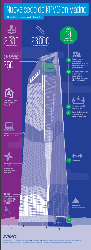
Diseño de estrategia para descubrir a los empleados cómo es la nueva sede de KPMG.
Prodigioso Volcán
Febrero de 2016


Diseño de estrategia para descubrir a los empleados cómo es la nueva sede de KPMG.
Prodigioso Volcán
Febrero de 2016


J. Kellick Bathurst
Library of Congress Geography and Map Division
History of the Civil War in the United States, 1860-1865 J. Kellick Bathurst, compiler; Edward Perrin, del.; Courier Litho. Co., Buffalo, N.Y. (Civil War Map Poster measured in inches 26 x 36)
Amazon
This time line map of the United States Civil War was originally produced in the mid 1860’s, by Comparative Synoptical Chart Co, Ltd.
Dimensions: 26″ x 36″
Item #1W-US-CW-1860
Shipping Weight: 2 lbs.
PRICE: $44.95
Mapas históricos de EEUU
1600-1938
El Rev. Green da acceso a una visualización óptima del gráfico.
Aquí.
Interactivo de Javier Barriocanal
Aquí.
Sudán del Sur
Votación de independencia
Entre el 9 y el 15 de enero, 3,9 millones de habitantes del sur de Sudán deben decidir si quieren seguir unidos al norte o formar una nueva nación.
EL MUNDO
9 de enero de 2011
El nuevo mapa de la Agencia Espacial Europea.
21 December 2010
ESA’s 2009 global land cover map has been released and is now available to the public online from the ‘GlobCover’ website. GlobCover 2009 proves the sharpest possible global land cover map can be created within a year.
The map was produced using 12 months of data from Envisat’s Medium Resolution Imaging Spectrometer at a resolution of 300 m.
ESA and Belgium’s Université catholique de Louvain created the map using software developed by Medias France and Germany’s Brockmann Consult on data collected from 1 January to 31 December 2009. GlobCover 2009 was generated within a year of acquiring the final satellite data.
The map’s legend uses the UN Food and Agriculture Organisation’s Land Cover Classification System.
Some 8000 people have downloaded the previous version, GlobCover 2005. These maps are useful for studying the effects of climate change, conserving biodiversity and managing natural resources.
Credits: ESA 2010 and Université Catholique de Louvain
Visualización de las relaciones de amistad en Facebook.
Por Paul Butler, ingeniero de la red social.
‘Visualizing data is like photography. Instead of starting with a blank canvas, you manipulate the lens used to present the data from a certain angle.
When the data is the social graph of 500 million people, there are a lot of lenses through which you can view it. One that piqued my curiosity was the locality of friendship. I was interested in seeing how geography and political borders affected where people lived relative to their friends. I wanted a visualization that would show which cities had a lot of friendships between them.
I began by taking a sample of about ten million pairs of friends from Apache Hive, our data warehouse. I combined that data with each user’s current city and summed the number of friends between each pair of cities. Then I merged the data with the longitude and latitude of each city.
At that point, I began exploring it in R, an open-source statistics environment. As a sanity check, I plotted points at some of the latitude and longitude coordinates. To my relief, what I saw was roughly an outline of the world. Next I erased the dots and plotted lines between the points. After a few minutes of rendering, a big white blob appeared in the center of the map. Some of the outer edges of the blob vaguely resembled the continents, but it was clear that I had too much data to get interesting results just by drawing lines. I thought that making the lines semi-transparent would do the trick, but I quickly realized that my graphing environment couldn’t handle enough shades of color for it to work the way I wanted.
Instead I found a way to simulate the effect I wanted. I defined weights for each pair of cities as a function of the Euclidean distance between them and the number of friends between them. Then I plotted lines between the pairs by weight, so that pairs of cities with the most friendships between them were drawn on top of the others. I used a color ramp from black to blue to white, with each line’s color depending on its weight. I also transformed some of the lines to wrap around the image, rather than spanning more than halfway around the world.
After a few minutes of rendering, the new plot appeared, and I was a bit taken aback by what I saw. The blob had turned into a surprisingly detailed map of the world. Not only were continents visible, certain international borders were apparent as well. What really struck me, though, was knowing that the lines didn’t represent coasts or rivers or political borders, but real human relationships. Each line might represent a friendship made while travelling, a family member abroad, or an old college friend pulled away by the various forces of life.
Later I replaced the lines with great circle arcs, which are the shortest routes between two points on the Earth. Because the Earth is a sphere, these are often not straight lines on the projection.
When I shared the image with others within Facebook, it resonated with many people. It’s not just a pretty picture, it’s a reaffirmation of the impact we have in connecting people, even across oceans and borders’.
Paul is an intern on Facebook’s data infrastructure engineering team.
Mark Zuckerberg
For connecting more than half a billion people and mapping the social relations among them; for creating a new system of exchanging information; and for changing how we all live our lives, Mark Elliot Zuckerberg is TIME’s 2010 Person of the Year
¿Cuándo morirán los diarios impresos?
Gráfico de Futureexploration.
Ross Dawson, futurista.
Ross Dawson is globally recognized as a leading futurist, entrepreneur, keynote speaker, strategy advisor, and bestselling author. He is Founding Chairman of four companies: professional services and venture firm Advanced Human Technologies, future and strategy consulting group Future Exploration Network, leading events firm The Insight Exchange, and influence ratings start-up Repyoot.
Ross is author most recently of Implementing Enterprise 2.0, the prescient Living Networks, which anticipated the social network revolution, and the Amazon.com bestseller Developing Knowledge-Based Client Relationships (click on the links for free chapter downloads). He is based in Sydney and San Francisco with his wife jewellery designer Victoria Buckley and two beautiful young daughters.
Below are the factors:
FACTORS DRIVING THE PACE OF NEWSPAPER EXTINCTION
GLOBAL
Increased cost performance of mobile phones
Increased cost performance of tablets/ e-readers
Development of high performance digital paper
Changes in newsprint and print production costs
Uptake of digital news monetization mechanisms
Trends in advertising spend and allocation
Development of open platforms
NATIONAL
Technology uptake
Fixed bandwidth availability and costs
Mobile bandwidth availability and costs
Smartphone and e-reader penetration
Economic development
Economic growth rate
Wealth inequality
Urban/ regional wealth disparity
Industry structure
Financial position of leading newspapers
Balance of advertising and print sales revenue
Newspaper distribution structures
Demographics
Age structure, birth rates, and immigration
Degree of urbanization
Increase in literacy
Government
Degree of regulation
Government financial support for media
Censorship and obstruction
Consumer behaviors
Media channel preferences
Willingness to pay for news
Relative interest in local and global news
Giro d´Italia, 2011
19/10/2010 – Tour 2011 : honneur au Galibier3471 kilomètres de course, répartis sur 21 étapes, dont deux disputées en contre-la-montre, sur les routes de 34 départements français, avec une visite en Italie.
Le parcours du Tour de France, dévoilé ce matin au Palais des Congrès de Paris, s’appréhende comme un voyage au cœur des terres de cyclisme du pays. Après le Grand Départ, accueilli en Vendée pour la cinquième fois de l’histoire, le peloton séjournera en Bretagne, puis se dirigera vers le Massif Central pour une première explication entre grimpeurs, programmée à Super Besse. L’entrée dans la haute montagne se fera ensuite par les Pyrénées, avec trois étapes corsées en dénivelé. Au terme de cette série, le vainqueur au Plateau de Beille sera particulièrement observé : jusqu’à présent, tous ceux qui y ont gagné se sont aussi imposés à la fin du Tour.
Pour l’exploration des Alpes, les organisateurs ont tenu à associer leurs voisins italiens, qui fêteront en 2011 le 150ème anniversaire de l’unité italienne, et qui ont eux aussi fait honneur à la montagne dans la longue histoire du Giro. Un autre anniversaire sera célébré pour le retour en France du peloton : lors de la 18ème étape, les coureurs feront route vers le Galibier, que le Tour a découvert cent ans plus tôt, en 1911. Cette fois-ci, la ligne d’arrivée sera la plus haut perchée de l’histoire, à 2 645 mètres d’altitude. Toutefois, l’étape du lendemain sera peut-être encore plus décisive, avec une bataille courte mais intense de 109 km, qui conduira une seconde fois les champions au Galibier, puis sur l’ascension de l’Alpe d’Huez. A 48 heures de l’arrivée, la lutte pour le Maillot Jaune pourrait encore connaître des rebondissements, sur l’unique contre-la-montre individuel du Tour 2011, dessiné autour de Grenoble.