BOOKS: Unruly Alphabet, Aaron McKinney

Gracias por visitar el sitio de Juantxo Cruz

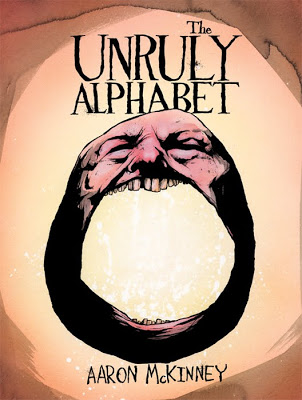
Unruly Alphabet
Aaron McKinney
Hardcover: 32 pages
Publisher: Mark Batty Publisher (November 9, 2010)
Language: English
ISBN-10: 1935613057
ISBN-13: 978-1935613053
Product Dimensions: 9.4 x 7.1 x 0.4 inches

Gracias por visitar el sitio de Juantxo Cruz

In The Unruly Alphabet, illustrator Aaron McKinney uses the Latin alphabet to create a lively and haunting abecedary. The restless glyphs tangle and spar with one another, setting the stage for scenes where «A was arrested, while B bit bullies» and «G is gored, which makes H hurl.» McKinney renders the scenes with macabre detail and sinister wit, and the accompanying captions hum with gallows humor. The Unruly Alphabet is truly an alphabet book like no other, for the brooding child in every adult.

Gracias por visitar el sitio de Juantxo Cruz

What if the letter A were an aggressive drunk who got into barroom brawls with his neighbor, B? Taking the term «word play» literally, illustrator Aaron McKinney sets the alphabet against a backdrop of rebellious behavior in The Unruly Alphabet. From hurling to undressing, McKinney’s bold renderings are darkly comical. By revealing the devilish characters embodied by each letter, they visually showcase human nature.

Aggressive and detailed, McKinney’s cantankerous glyphs compete in strange and nightmarish ways—C is chased by a devouring D, M mauls a napping N, and S swallows and terrorizes T.

Gracias por visitar el sitio de Juantxo Cruz

«I’ve always been interested in etymology,» McKinney says. «The way words, a human constructed concept, play off one another to somehow convey thought and expression in our minds fascinates me. With that thought in mind, I decided to strip language down to its most primitive form, the alphabet. To make it interesting, I anthropomorphized each letter with some of humanity’s most common, despicable traits. With each letter playing off the next, the end result is the alphabet, a pretty inorganic and deliberate thing made more barbarically human.»

IMAGENES

TYPE: Hoefler & Frere-Jones, NY

Typography.com.
Desde 1989, Jonathan Hoefler (presidente) y Tobias Frere-Jones (director de tipografía).
Tipógrafos.
Rolling Stone, Harper´s Bazaar, The New York Times Magazine, Sport Illustrated, Esquire, Business 2.0, The Wall Street Journal…
Hoefler & Frere-Jones, Inc.
611 Broadway, Room 728
New York, NY 10012-2608

Tel. 212 777 6640
Fax 212 777 6684
info@typography.com

Gracias por visitar el sitio de Juantxo Cruz

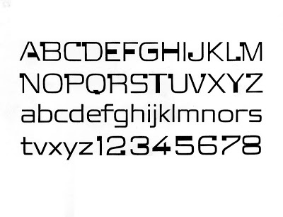
Familia Tungsten

Gracias por visitar el sitio de Juantxo Cruz

Numbers

Gracias por visitar el sitio de Juantxo Cruz

Chronicle

Gracias por visitar el sitio de Juantxo Cruz

Gotham

Gracias por visitar el sitio de Juantxo Cruz

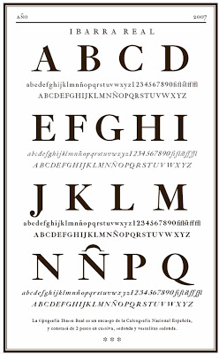
Sentinel

TYPE: En memoria de Vivian Ridler

Gracias por visitar el sitio de Juantxo Cruz

Gracias por visitar el sitio de Juantxo Cruz

Gracias por visitar el sitio de Juantxo Cruz

Gracias por visitar el sitio de Juantxo Cruz

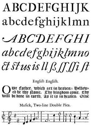
El pasado domingo falleció Vivian Ridler (1913, Cardiff-2009) tipógrafo e impresor de la ‘Oxford University Press’ (1958-1979). Fue profesor de tipografía en el Instituto de Londres ‘City & Guilds’.

Su tipografía se basaba en la tradición del también tipógrafo Stanley Morison. Ridler diseñó el libro de Morison ‘John Fell, the University Press, and the Fell Types’ (275 páginas sobre tipografía del siglo XVII).

Imprimió el famoso ‘Rotz Atlas’ para Lord Eccles, ‘the Great Tournament Roll of the Collage of Arms’ (1969) o ‘the New English Bible’.

Fue presidente de ‘The British Federation of Master Printers’ (1968-69) y del ‘Double Crown Club’ (1963). Se retiró de la profesión en 1978.

Links:
http://visualwikipedia.com/en/Vivian_Ridler

http://www.oup.com/

!Gracias por visitar mi sitio! | Copyright © 1992- 2025 juantxo_cruz. Todos los derechos reservados.